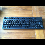
I've been on the hunt for a really good Mac mechanical keyboard for a little while now. I got a Razer BlackWidow for my PC over Christmas and forgot just how much I love mechanical keyboards. I've been using an Apple wired keyboard for roughly 5 years now, and while I like that keyboard, I forgot that mechanical keyboards are awesome for real typing.
But I couldn't find a keyboard I really liked. So I made one. This is the Instigator Keyboard.
I owned a first edition Matias Tactile Pro for years, but I was disappointed in quality. I had to send it in for repairs three times. I recently tried desperately to get it working again, even going so far as putting it through the dishwasher. But no luck, it just does not want to work reliably anymore. So when it came time to buy a new keyboard, I really didn't want to sink more money into a Matias.
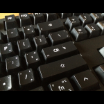
But Matias did something really handy... each key is adorned with each symbol from the modifier versions. So if you wanted to type a copyright symbol, the keyboard is your own reference. But Matias made a mistake in implementation, they put the symbols in seemingly random locations. What I mean is that although I could tell the "G" key would type the copyright symbol, I couldn't tell if that was option-G, or shift-option-G. I solved that problem with my keyboard. The function key has a legend. It gives you hints that the upper-left corner is reserved for shift-modifiers, the upper-right is reserved for shift-option-modifiers, and the lower-right is reserved for option-modifiers. You can see the function key in the second picture.
I also chose to use symbols for many of the keys. Not only that, but I used the Apple Symbols font to get the exact same symbols on the keyboard as you'll see in OS X's menus.
Here's where this keyboard begins to diverge from the norm even more. Most of the navigation keys (tab, escape, page up, home, etc) have been labelled with ASCII key codes in the lower left. No more visiting ascii-table.com for reference. When designing a custom control, it is now much easier for me to see which codes I need. Further, since I can never seem to remember the technical difference between a CR and an LF, I adapted the return key to tell me. As somebody who is more than a little familiar with HTTP, you'd think I'd have CRLF down by now, but I don't.
Now, let's speak about that font. Being my own keyboard, I chose a font that wasn't exactly... perfect for a keyboard. In fact, I'd go so far as call this a horrible font for a keyboard. My wife complains that they keys look like the paint is peeling. Well first of all, there's no paint, these are UV printed. Second of all, that's the nature of the font. It is the font I use for my logo. It felt appropriate. The modifier reference font is more normal, opting for OS X's system font, Lucida Grande.
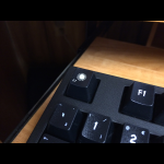
This keyboard was manufactured by WASD Keyboards, makers of Jeff Atwood's CODE keyboard. The quality on this is fantastic. Their printing resolution is absolutely incredible. I was actually worried that my media key indicators were too small to print legibly. Nope, they came out perfectly. Even at such a small size, every bit is perfectly legible. In terms of customization options, obviously you can custom print an entire key set. But you can also choose each individual key color. Plus, you don't have to be a designer to customize your own keyboard as they have a web-based keyboard designer you can use to choose exactly which layout you like, how you like your media keys to be labelled, what symbol your OS key should show... nearly everything.
You can also opt to have dampeners installed on each of the keys. These will reduce the sound your keyboard produces, at the cost of a reduction in travel distance. There are two models, 0.2mm and 0.4mm. Obviously, the larger one performs better at a greater cost of travel distance. I got the 0.4mm on mine, but I'm not sure I like it. Only time will tell. They can be removed though, which is especially easy since WASD includes a nice key puller in every box.
So... what if you really like what I've done? Well, I made two versions of my layout file. The second version uses a font designed for source code, the aptly named Source Code Pro. It has no decoration on the space bar, and the escape key uses Apple's escape key symbol. I call that version the "True Keyboard of the Mind" - RPG fans will understand the name. You can download the layout, head over to WASD Keyboards, choose a 104-key keyboard and upload this file as your layout. Leave all the keys blank, but you can choose the key color. If you choose a dark key, the print is automatically white. If you choose a light key, they print is automatically black. So you don't have to worry about the layout being designed in black. This keyboard layout is pretty exclusively Mac, I don't have a Windows equivalent. Once you receive your keyboard, you'll want to access the DIP switches on the back and set switches 1 and 6 to on, all others off.
And that's how I solved my Mac mechanical keyboard dilemma. This is a keyboard built for typing, with a layout designed for coding on the Mac. Is it the best keyboard ever? I'm not sure, but I'm pretty damn happy with it.
Update: After posting this entry, I sent the link to WASD. Turns out they remembered my keyboard because they've never printed a key set with such intricate details before. The print quality surprised even them. In fact, they told me they almost took pictures for their website, but my main key font concerned them. The fear is that the font might actually make people think their printing wasn't as good as it is. It makes perfect sense from a marketing perspective. I kind of hope they use my alternate layout to print a set to photograph.
 |
| truekeyboardofthemind.zip ( 143.8 KB ) |


